
Small rooms are not a design failure — they are a constraint, and constraints have solutions. The difference between a room that feels cramped and one that feels open rarely comes down to square footage. It comes down to how light moves through the space, where the eye travels, and whether the furniture is fighting the room or working with it. None of that requires a contractor or a permit. What it does require is understanding why certain rooms feel small in the first place, and which changes actually move the needle.
Why Rooms Feel Smaller Than They Are
The perception of space is governed mostly by three things: contrast, visual interruption, and ceiling height relative to the field of view. A room with four different paint colors on accent walls, mismatched furniture legs, and curtains that hang just above the window frame will feel significantly smaller than the same room painted a single tone with floor-length curtains hung at ceiling height — even though not a single square foot changed.
Visual interruption is the underappreciated culprit. Every time the eye hits a hard stop — a dark baseboard, a rug that floats in the middle of the floor without touching the furniture, a curtain rod at standard height — the brain registers a boundary. Accumulate enough of those boundaries and the room starts to feel like a series of small boxes stacked together rather than one cohesive space.
Ceiling height perception works the same way. There is often a difference between the actual dimensions of a space and how large or open it feels. That distinction matters when physical dimensions need to be understood accurately, including in the work of land surveyors. In interior design, vertical lines draw the eye upward and can make a space read as taller than it measures. Tall bookshelves, vertical-stripe wallpaper, and floor-to-ceiling drapery exploit that effect without adding a single inch of actual height.
The practical takeaway: before spending anything, walk through the room and count how many visual hard stops exist at eye level and below. Reducing that number by half will do more for perceived space than almost any furniture swap.
Color, Light, and the Mistakes That Make Rooms Shrink
Paint color is the most discussed tool in the space-expanding toolkit, and also the most frequently misapplied. The conventional advice — paint everything white — is correct in principle but often executed incorrectly. Bright white on walls with warm-toned wood floors and cool-toned furniture creates contrast that highlights the room’s edges rather than softening them. A better approach is tonal consistency: choose a white or light neutral that matches the undertone of the room’s dominant fixed element, whether that is the flooring, the trim, or the upholstery.
Lighting is where the real leverage lives. A single overhead fixture, even a bright one, creates a pool of light surrounded by shadow, which makes the walls visually advance. Layered lighting — ambient, task, and accent — distributes light more evenly and pushes the perceived boundaries of the room outward. Specifically:
- Add at least one light source below eye level, such as a table lamp or floor lamp, to break the ceiling-down pattern that a single overhead fixture creates.
- Use bulbs rated between 2700K and 3000K for living spaces; cooler light above 4000K can feel clinical and tends to flatten surfaces rather than give them warmth and depth.
- Place a mirror on the wall directly opposite the room’s primary light source — not beside it — to reflect light back across the full depth of the space rather than just bouncing it sideways.
The mistake most people make is addressing color and light separately. They get a paint consultation, then buy lighting independently, then wonder why the result still feels off. These two elements interact directly — the color you choose will look different depending on the color temperature of your light sources, so finalize the lighting setup before committing to paint.
Furniture Scale, Placement, and the Floor Beneath It
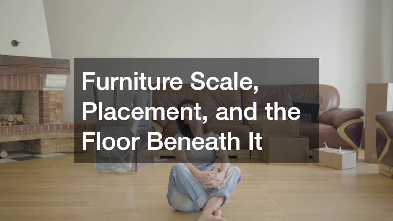
Furniture is where good intentions most often backfire. Buying smaller furniture to open up a room sounds logical, but undersized pieces in a small room tend to make the space feel more cluttered, not less, because more individual items are required to fill functional needs. A single large sectional anchored by one rug will almost always read as more spacious than three separate seating pieces with two different side tables.
The ground rules for furniture scale in tight spaces:
- Choose pieces with exposed legs wherever possible — sofas, chairs, and beds that reveal floor space beneath them visually extend the floor plane and make the room feel less blocked.
- Keep the largest furniture piece pushed to the wall that faces the room’s entry point, so the first sight line on entering is unobstructed floor space rather than a furniture edge.
- Size rugs to sit under at least the front legs of every major seating piece — a rug that extends 18 to 24 inches beyond the sofa on each side will make the seating zone feel intentional and expansive rather than isolated.
Furniture arrangement matters more than furniture size. Two identical living rooms with identical furniture can feel dramatically different based on whether the pieces are arranged to create a clear path through the room or whether traffic flow forces you to navigate around corners. Aim for a primary path that is at least 36 inches wide — the standard for comfortable circulation — and arrange secondary seating around that corridor rather than blocking it.
Storage as a Design Tool, Not an Afterthought
Clutter is the fastest way to shrink a room, and the response is usually to buy more storage. The problem is that visible storage — open shelving filled with mismatched objects, freestanding bins, stacked boxes — adds visual noise without solving the underlying problem.
Built-in or recessed storage changes that equation entirely. Shelving that runs floor to ceiling and wall to wall does three things at once: it removes clutter from sight, it draws the eye vertically, and it makes the shelving feel like an architectural feature rather than an addition. The cost range for custom built-ins varies widely — roughly $150 to $500 per linear foot depending on materials and complexity — but even flat-pack alternatives like IKEA’s KALLAX or Billy systems can be configured to span a full wall for a fraction of that price.
Vertical storage also outperforms horizontal storage in tight spaces. A tall, narrow cabinet occupies less floor area than a low, wide one while holding comparable volume. Reserve horizontal surfaces for a limited number of intentional objects — the general guidance is no more than three items per surface visible from the room’s entry — and store everything else behind closed doors.
Choosing the Changes That Will Actually Stick
The temptation with small-room design is to do everything at once and see what works. A more reliable approach is to work through changes in order of impact and cost — starting with paint and lighting (high impact, low cost), then addressing furniture arrangement (no cost, significant effect), then investing in storage if clutter is genuinely the limiting factor.
Not every room responds to the same fix. A bedroom with low ceilings has a different set of constraints than a narrow living room with good natural light. Identify the room’s single biggest visual problem — whether that is a cluttered floor plane, poor lighting, or too many competing colors — and solve that one thing completely before moving to the next. Incremental, deliberate changes are easier to evaluate and easier to reverse than a full overhaul.